Technology & Design
TfL required prototype screens to be tested across multiple locations throughout busy stations in the TfL network.
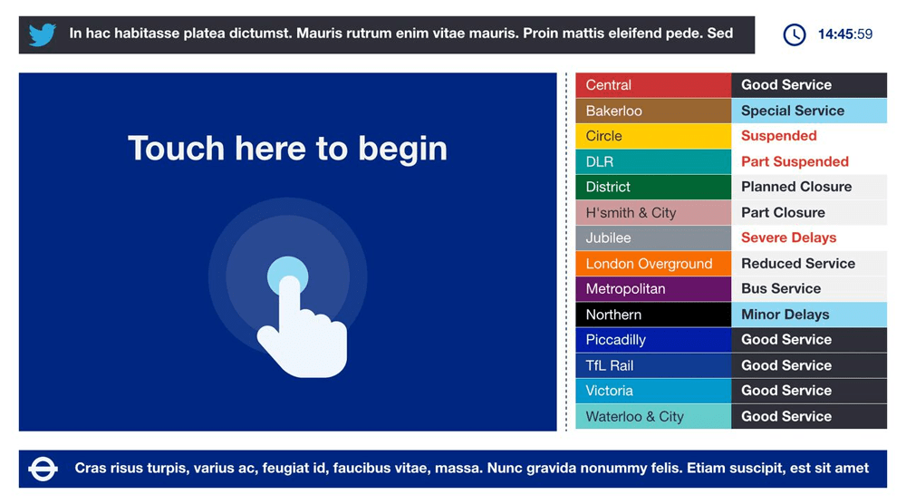
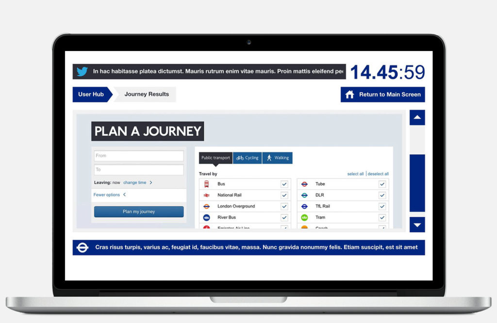
The screens would allow travellers to quickly navigate their current location, check and plan their current route, find out more about the local area and see the latest news and status updates from TfL.
The Challenge
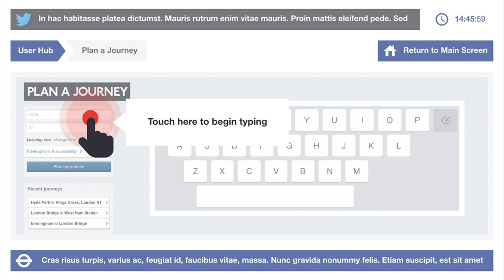
TfL tasked us with a UX and tech brief, to create a bespoke journey planning touchscreen kiosk that allowed customers to work out routes from their current location to another location through different transport methods such as the trains, buses and tram networks. The aim was to improve user journeys in both an online sense, as well as when getting from A to B.
The Impact
User experience was a core feature. The screens were targeted at those users who did not have access to mobile devices or who might not necessarily be up to date with modern technology. We worked closely with the TfL Head of Design to come up with a series of animated gestures and pointers that made the process extremely user friendly and intuitive for even the most inexperienced tech user.
We used existing internal APIs and scraped data from the website while creating an experience that felt seamless and was robust enough to cater for a large number of potential users and any security issues that brought. We came up with an organic user experience, wireframes, architecture, design and build within a 4-week period from start to finish.

The Results
We designed and developed a touchscreen experience for use within 2 core underground stations, Paddington and Cannon Street, with a view to roll out across a number of other locations in the future. The end result was an extremely user-friendly interface and a simple touchscreen process from start to finish, with key indicators that the screen was touch-sensitive to passers-by.
We also successfully implemented a number of fallbacks for any intermittent internet issues that may occur when live within the stations, as well as timing out considerations.
