Technology & Design
Principal & Prosper approached us with a vision: to transform their online presence from outdated to outstanding.
The Client
Principal & Prosper (P&P) is a firm of experienced Chartered Financial Advisers supporting individuals and businesses to shape their financial future.
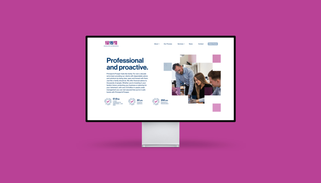
When Principal and Prosper came to us, their website was over 10 years old, and they decided it was no longer fit for purpose. They felt that it made the company look old-fashioned and out of date and did not reflect their brand and positioning.
A significant number of their customers are individual investors, generated through recommendations, so it was vital that their website accurately reflected the quality of the service they provide.
The Brief
Working in partnership with Principal & Prosper, we were tasked with designing and developing a brand new website, using a WordPress Content Management System (CMS) at the core. This ensured the site was user-friendly and easy for visitors to navigate. Additionally, it offered a straightforward administrative CMS and behind-the-scenes platform for admin staff to use, built with a combination of Gutenberg and ACF to create a simple-to-use and scalable backend.
Phase 1: Design Discovery
Kicking off with an immersive discovery session, we outlined the final structure of the new website. This included drawing up a final sitemap, wireframes and a detailed specification defining the key categories, page structure, on-page features and technology stack in more detail.
Phase 2: Design
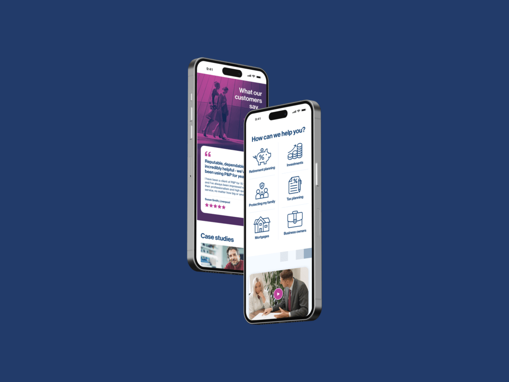
Next, our UX/UI team created a design that reflected the company’s trustworthiness and provided reassurance to customers that Principal and Prosper is a business that individuals and businesses can trust with investments. We started with wireframes of key pages and the core user journey, which were then transformed into high-fidelity UI designs.
Phase 3: Development
The new website was designed and developed to be responsive. We ensured that visitors now have access to the core features across all devices and browsers. This was achieved by building out the frontend with HTML5 animations and subtle gestures to make the website feel smoother. We also focused on optimising the overall user experience and highlighting the most important CTAs.
The Results
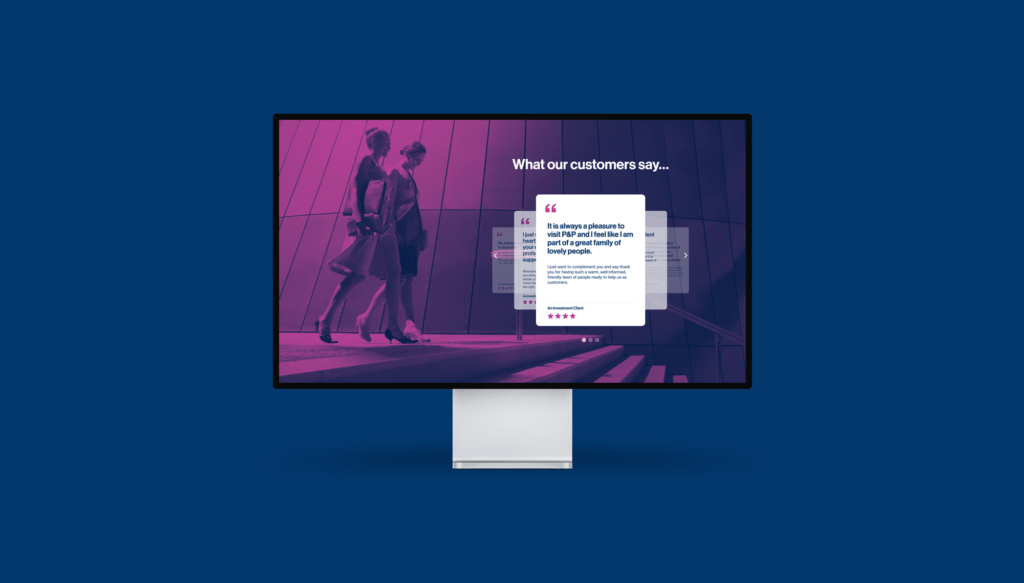
Principal and Prosper is a friendly and approachable financial services company, and a personable feel was a key inclusion to the site. Our new designs also conveyed their professional nature so individuals and companies alike would both feel confident in contacting Principal and Prosper for investment opportunities.
In addition to this, we also streamlined their services offering, creating a clear structure that could easily be navigated by users.
Our design work also extended to Principal and Prosper’s branding, and we created a new set of brand guidelines based on the updated website.

