How to run a User Experience (UX) review
Your users and your customers are the lifeblood of your business. Whether B2B, B2C or D2C, good User Experience (UX) puts them at the heart of your digital decisions and takes their needs into account.
Good UX helps build brand loyalty, define customer journeys, build trust and ultimately help boost customer conversions.
It’s vital to the success of your website or product.
At Bolland & Co, UX is at the heart of everything we do. Whether it’s improving the conversions of a website, creating a better user flow in software or even an improved workflow with your organisation, we start with the people and make sure their experience is as good as it needs to be – or better!
Assuming you / your client already have a website or software and are not starting from scratch, we have outlined our essential points on how to carry out a thorough User Experience (UX) review.
1. Get to know your UX stakeholders
At this stage, the people who know the project inside out, the goals and the pains should be a key priority.
The information you source from internal UX stakeholders will be invaluable in hypothesising the needs of the end user.
The first step should always be to source this vital information carrying out UX stakeholder interviews / workshops.
Before these interviews you should map out the most important questions that need to answered by each of them.
Hold a group session with key UX stakeholders on a project. The key people that need to be involved in the conversations from the project owner and production teams right through to the sales and marketing leaders.
Once the interviews and workshops have concluded, this information should be collated into a simple findings report which will form the basis for your next steps in the process.

2. Review analytics
Assuming you have access to the analytics of the website or product, you should review this in detail before making further assumptions. Analytics are the facts and they help build a real story of what people are actually doing.
If you don’t have Analytics access, ask for it. And keep asking until you get it. If not, a report between a certain period should suffice.
If it isn’t in place already, install Google Analytics at least to start understanding the key user flows, but also look for more advanced tools such as Tag Manager Kissmetrics, Hotjar and Clicky. These will help you build a broader picture of what’s actually happening.
3. Define your UX and project objectives
Having worked closely with the project stakeholders and reviewing the analytics, the next step is to define the key UX and project objectives. This can be done using the following techniques:
User personas
It’s essential to work alongside the project stakeholders to create your well defined customer personas. If they already exist, use this time to update them. The key consideration is that you can use these personas to efficiently identify and communicate the needs of the end users.
Objectives documentation
Each required component, story or feature must be written up and mapped out in detail. The key for this stage is to be able to define the objective for each. This has to provide essential clarity in the design and build stages.
User stories
Create user stories that define the core page, epic or feature objective which helps a user or person to achieve success. This will usually be done alongside the product owner for absolute clarity.
Acceptance criteria
These criteria need to be defined to understand the requirements that a key component or story must satisfy to be accepted by a user, customer or stakeholder. They will form the basis to define the boundaries and parameters and will be used to determine if a story or feature is complete.

4. Get to know your customers
Stakeholders are important. But don’t just take their word for it. In this day and age, it’s easier than ever to carry out actual user research to help focus the direction of the strategy.
Online user testing
First you need to define your tests.
From there, using tools such as Usability Hub or User Testing will collect snippets of useful information from real users, in record time.
One thing to note is that every test comes with a price tag so if you’re bootstrapping your testing this can soon spiral – keep an eye on your credits.
I would suggest getting a good spread across short User tests and would recommend between 30-50 users to start building a real picture of recurring pain points.
User testing
Alternatively, you can carry out traditional user testing. Hire / use a room with some laptops or screens setup, pull together a spread of people (usually 5-7) from your user personas and get those people in a room for a few hours.
Ask the users to run through your current setup and give them key questions to answer along the way. Speak with them, understand their experience and take note. Anecdotal user feedback is extremely powerful!

5. Carry out a heuristic expert usability review
The next stage is to undertake a usability review, using the heuristic inspection method. This involves evaluators inspecting the user interface (UI) design judging its compliance with recognised usability principles.
Each heuristic review should be bespoke depending on the objectives of your project, but you can follow a set format to define your approach to it. This includes:
Defining your heuristics
The original 10 rules of thumb were first conveyed by Jakob Nielsen and Rolf Molich in the 90s and have since been expanded on by with Ben Shnedierman’s eight golden rules. Examples include:
- Consistency
- Error prevention, recovery and handling
- Flexibility and efficiency
- Shortcuts
- Informative feedback
- Help and documentation
Use both in combination with market research, design guidelines and your stakeholder interviews to define your key heuristics.
Choose and brief your evaluators
Your evaluators should be made up of experts rather than end users. You need to brief them on the full details of the project and what they need to cover during their evaluation.
Run two evaluation phases
The first phase should be a general phase where the evaluators will pick out specific things they want to evaluate. They should carry out these essential evaluations in the second evaluation phase.
Recording problems
It’s essential for your evaluators to record any problems they identify in the second evaluation phase, usually mapped out in a spreadsheet. They must adequately debrief you to ensure everything is considered before creating any prototypes.

6. Next steps
It’s the aim to pull quick wins from your UX review. This is the key component for businesses to make quick, impactful change without overhauling everything (if that’s not necessary).
Create a report of your key findings in an evaluation document highlighting both quick wins, business critical and also general ‘nice to have’ outcomes.
Don’t be too one-sided here. You want balanced feedback so not to alienate the decision makers in the current version – only focusing on the negatives can quickly turn people off.
This should allow you and the stakeholders to prioritise the next actions clearly and readily.
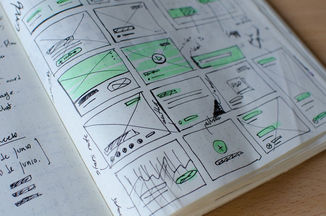
Once complete, we would suggest creating wireframes and prototypes and carrying out further simple user testing of any changes to get quick feedback before permanently implementing change.
By doing your UX review this way, you should come away with educated outcomes that will actually work for your users. Put the work in up front and it will pay off down the line.
7. Keep your UX agile
Once you’ve conducted a full UX review, you will be able to begin to generate the solution and refine any ideas you may have. Key here is that both the core challenge and usability objectives are met.
Using an agile methodology to UX means that a user-centric approach should be taken to the discovery, definition and delivery phases of a project.
End users must be involved in specific feedback loops through wireframing and prototyping. This ensures that the system / website and its features are fully usable and meet both the objectives of the business and the needs of the end user.
Once complete, you can then move onto prototyping (mobile first is essential for good UX) and iterate as you go.
But your UX reviewing shouldn’t finish there. It should evolve and grow over time and form part of your continual development process.
Don’t make UX an afterthought…

