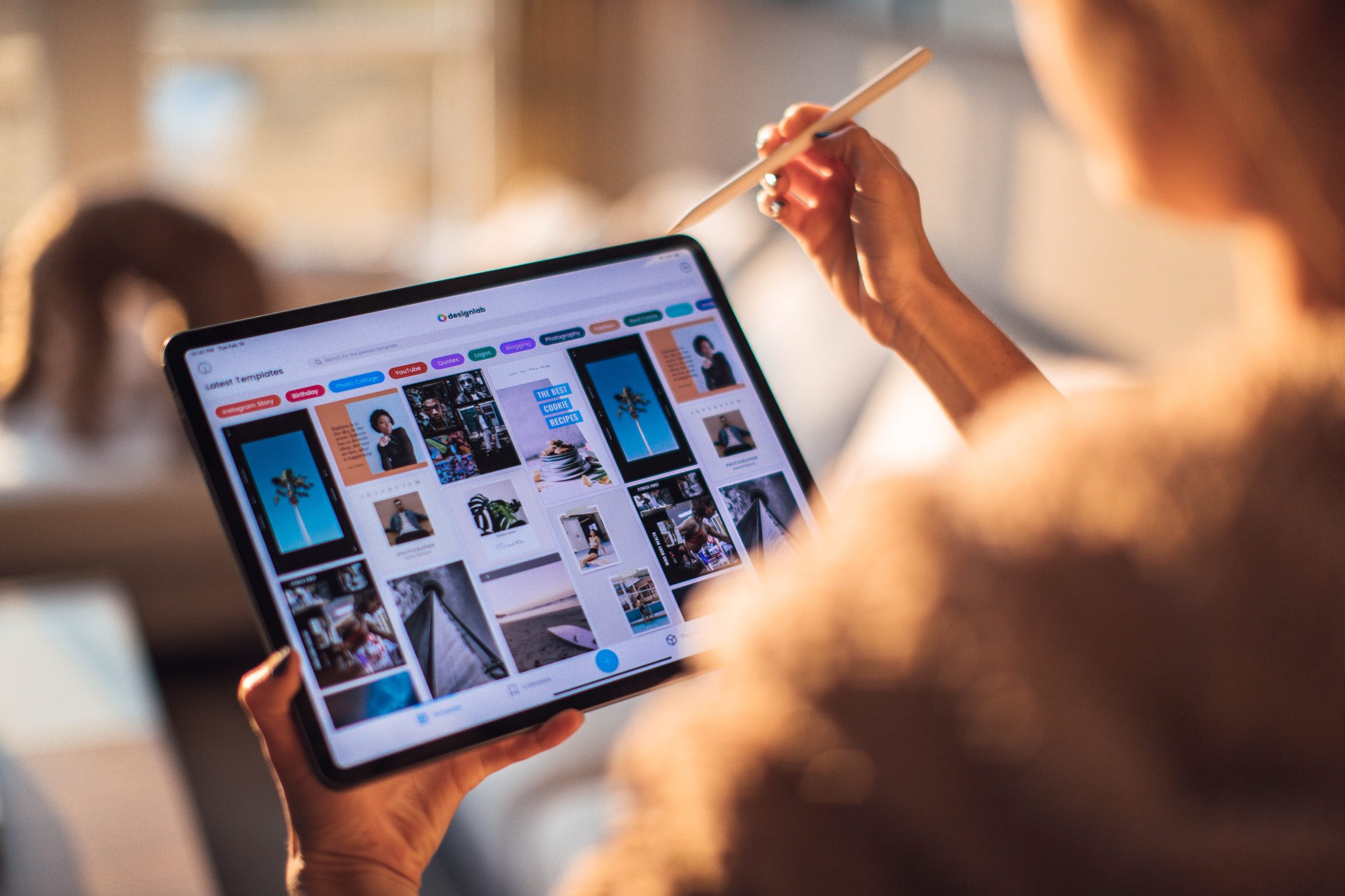
Did you know, more mobile devices were bought in 2011 than computers? As more people realise how easy it is becoming to browse the web on a tablet, the more popular they are becoming.
Most websites now offer a mobile-friendly option. iPad and Android tablets seemingly manage full-sized websites, but the need for a mobile version is its touch aspect. It’s important therefore to keep up with the touch trend, so that your website can function as planned, not only on a desktop device, but on a mobile device too. So, what makes touchscreen devices so different?
Firstly, we should consider the accuracy of tapping a screen with (usually) our fingers. I don’t know about you, but my fingers are clumsy, and it can take me many attempts to tap the right button or hyperlink on a badly designed website, not to mention that I am forever making typos.
The way around this is to ensure there is plenty of space around individual click-able items. Also, ensure your click-able items are not on the right hand side of the screen. This is where users will scroll, and so can easily click something when they were wanting to scroll instead, and vice versa. Remember too, that on a touchscreen the finger is swiped up, unlike with a mouse which users would move down.
It can be useful to remember that touchscreen users can use more than one finger at a time to control it, potentially altering the way they navigate a website. As they aren’t using a mouse, there is no mouse pointer either to indicate click-able items, nor are hover states an option. On that note, hierarchies, like sub-menus, are out, as they are too difficult to be kept open without a mouse.
As most touchscreen tablets have a glass screen, there is a greater chance of glare when exposed to bright light, making reading information very difficult. Glass screens are also more prone to fingerprints and smudges. This can change the way your website is seen by a user. If your website has a black background, for example, this will increase the glare and make fingerprints more visible, as well as acting as a mirror and reflecting everything other than what’s on their screen.
Like we mentioned earlier, it’s all too easy to make typos using a touchscreen keyboard. For this reason, it’s best to avoid any data entry that is longer than absolutely necessary, as the burden of having to battle their touchscreen keyboard is enough to send a user off and packing to another company’s website.
Here at Bolland & Co, these are all things we consider in creating great touchscreen-friendly websites for our clients, and we ensure that every website is as easy to use as possible.
For further information on how we can help your company grow through technology please contact us today or call us on 0208 133 8210.
