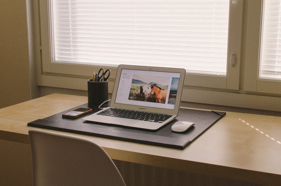
In the world of the web, image can be everything, and using the wrong images on your website could be damaging. It’s important that the imagery you are using reflects your brand in the right light and draws visitors in. Here’s 3 ways images can make your website successful.
First impressions
First impressions count, so ensure your website is neither overly busy with images, nor in desperate need of them. With the right amount of images in the right positions, users are more likely to stay on your website. Bare in mind too, that not every page needs an image. Sometimes less is more.
If you’re using a website template that gives placeholders for images already laid out for you, although this can be really useful, bare in mind the quantity and positioning of the proposed images in regards to the context of your website and your goal. Not all of these placeholders may be necessary.
It is very common for websites to use stock images, and it’s perfectly acceptable to do so. If you are able to mix these up with some of your own original images that have been taken specifically, then even better.
Supporting images
Generally, web users will scan-read, as they are often accessing a website to quickly absorb information or make a purchase, and don’t want to hang around too much. To ensure your content is read properly, keep it brief. We suggest around 50-60 characters per line, using plenty of short paragraphs.
Support your written content with appropriate images which will break up the text, making it more digestible, as well as more visually attractive. When web users are faced with a giant block of text they more than often leave a website, or scroll through it until they find that hyperlink or ‘buy now’ button they’re after. Incorporating images is your best chance of getting them to stay and read. Check out our blog post on achieving great readability for more tips when it comes to written content.

The right image
Similarly, it’s important that you select the right image for breaking up your copy. With images being the factor that keeps a user on your page, once the image is seen, they will scroll to find the relevant content, having already been given the clue. Avoid, then, using images that don’t contribute to a webpage in any way, and instead only use images that are painting a picture of your brand and further illustrate the content of your website.

Conclusion
With both the short-attention span of web users, as well as the speed at which users consume information online, images are your best chance at grabbing and holding their attention. When used right, with the appropriate amount of images, positioned well, images can be hugely beneficial to the success of your website.
If you’d like an experienced team to take over and build you a website with imagery that will help your brand succeed online, please don’t hesitate to get in touch. We’d love to hear from you.
