Technology & Design
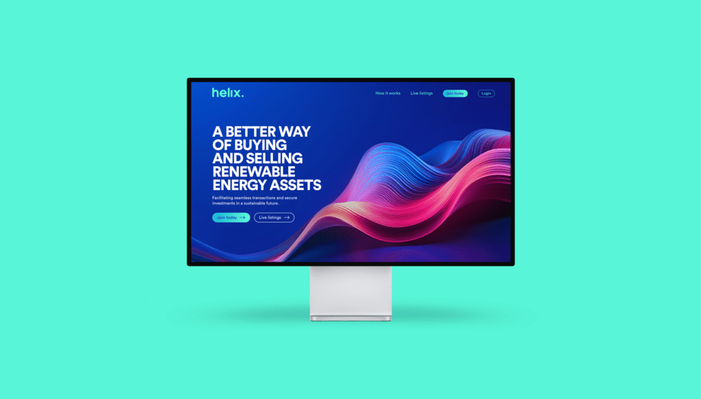
We took on the exciting challenge of revitalising Helix, the UK’s pioneering renewable energy marketplace. Upon inheriting the platform from their previous technology partner, we embarked on a comprehensive journey to transform their digital presence.
Phase 1: Technology Takeover
Upon assuming control of the platform, our first task was to conduct a meticulous code review.
Our in-depth audit process is designed to assess critical system details, which includes:
- Code audit – A comprehensive review of the underlying code and code quality.
- Hosting & repo takeover – A takeover of hosting and repos, including development and staging environment setup.
- Stability assessment – An in-depth security and performance review assessing system stability.
- Manual Testing – An end-to-end test and review to manually check for bugs and any visual defects.
- Findings document – A detailed write-up of the site architecture and a summary of our findings in a report doc.
- Roadmap – A traffic light system of issues and improvements backlogged in order of priority ready to be implemented.
As part of our backend work, we also moved Helix’s infrastructure to AWS, allowing us to create secure and public environments through the Virtual Private Cloud (VPN) structure and lock these down to relevant locations.
Phase 2: Takeover Roadmap
For this phase, we worked from the backlog of findings, implementing quick wins and any critical issues that required addressing to go live. This included both visual and functional defects, with a test-and-learn approach to some core functions to improve UX over a period of time.
We delved deep into the existing codebase, addressing crucial areas such as security vulnerabilities, performance bottlenecks, and UX enhancements. Swiftly resolving urgent bugs, we also identified mandatory and optional process improvements to enhance the overall functionality of the marketplace.
Phase 3: Design Discovery
We initiated a collaborative process with the Helix team, engaging in iterative development to ensure seamless integration of new features and improvements. Continuous consultations allowed us to align our efforts with Helix’s vision, fostering a productive and transparent partnership.
With the technical foundation of the marketplace solidified, our UX and UI teams conducted immersive design workshops. These sessions paved the way for a full-scale system redesign, focusing on creating an intuitive and visually appealing interface.
Phase 4: Design and Build
We meticulously crafted wireframes in Adobe XD that translated conceptual ideas into tangible designs, fostering a user-centric approach.
The approved wireframes served as the blueprint for our prototyping phase. Our UI designers brought these concepts to life as high-fidelity UI designs, ensuring seamless navigation and visually engaging interfaces. These designs were meticulously implemented by our engineering team, converting them into frontend components that seamlessly integrated with the pre-existing Django backend.
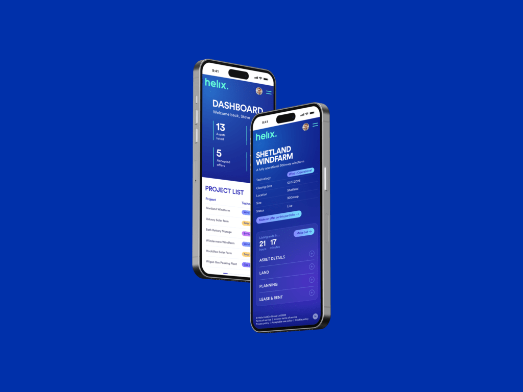
To enhance user experience, we restructured the information architecture, simplifying complex pathways and reducing unnecessary steps. Through the strategic use of popup modals, we minimised user efforts and streamlined interactions. Additionally, we introduced a vibrant colour scheme, enabling users to differentiate between various technologies and features effortlessly.
The Results
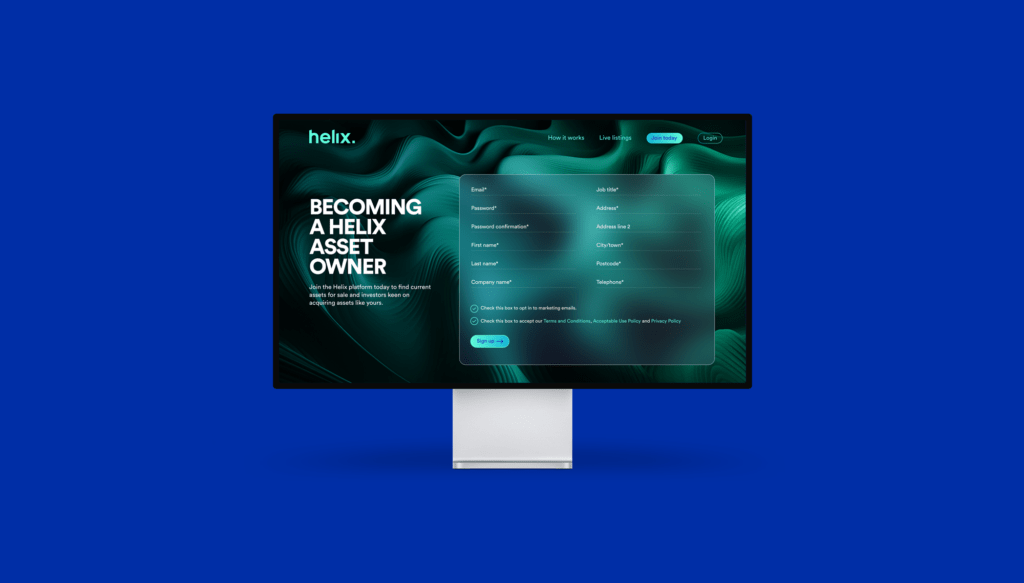
The culmination of our efforts resulted in a transformative makeover for Helix. The brand now boasts a fresh, modern look, coupled with a powerful backend that empowers a growing customer base and the user-friendly marketplace. Our redesign not only elevated the aesthetics but also enhanced the platform’s functionality, ensuring that Helix stands tall as the go-to renewable energy marketplace in the UK.
Since rolling out the new designs across the website, Information Architecture has been ordered in a more intuitive manner, unnecessary steps in the process have been reduced through the introduction of popup modals, and a more modern colour palette/style has been introduced to bring the experience to life and streamline the customer journey.

